


Fomo is a SaaS platform which helps eCommerce platforms improve their conversion rates by using the concept of Fear Of Missing Out. I helped them by leading a UX Design project to improve upon their onboarding flow and fix other ux related issues I found along the way.
Well, what does that actually mean? Imagine you are out with your friends, you’re hungry and all of you decide to eat tacos. You see two taco stands, one with a long line of people waiting to place their order and the other one with barely a few people there. Which one of them would you rather order your tacos from? The first one, right?
This is Fear Of Missing Out and looking at the crowd in front of the first taco stand makes us feel that their tacos are awesome because obviously so many more people are vouching for the store just by their presence!

Image borrowed from usefomo.com
Want to know how exactly they do it? Check them out at usefomo.com and see their 40 second video :)
Problem Statement:
The founders of the company are seeing an drop in their customer onboarding and retention during the sign up process
What I did:
I sent out a Google survey to get the lay of the land while going through FullStory reports, I understood and empathized with the issues people were facing by talking to their customer service specialist. I also did competitive + comparative analysis, facilitated and performed user interviews along with usability studies to find out the missing piece of the puzzle and deliver my insights.
Platform:
Desktop Website.
Time:
Five weeks.
Tools:
Google Surveys, FullStory, Trello, Omnigraffle, Sketch 3, Sticky notes, Google Forms, Google Sheets, Google Docs, Calendly, Adobe Photoshop and Premiere.
Team:
Just me
The Process:

I followed the above process to not only understand the problem but also learn more about the company and the product because I was totally new to this field and type of work. This was very important in order for me to empathize and connect with the people who are using this. Every step provided massive insights and the usability studies were done on their current staging platform.
1. Google Surveys:
Responses received: 15
I had a theory that since Fomo was a new company offering a new product into this space, people don’t trust the brand enough for them to be able to provide their credit card details so I asked them questions around feeling safe and what their preferences were.
I compared several online platforms which provided an online service with a free trial by capturing people’s credit card. I dove into deep research and reading on what are the best practices for something like this:
- do you capture the credit card information during the sign up process of the free trial?
or
- do you ask for it once the trial is over?
What I learned:
- Our main inspiration driver will be Netflix
- Our onboarding process should be super easy to setup since the survey reported this to be one of the main factors affecting the overall effectiveness and user experience
- A website being user friendly takes top priority which surprised me because I thought building trust will be the key element.
- Good copy and front loading the work has a great natural effect of build trust with the users.
- This will also help with increasing the brand reputation in the long run.
- Hulu Plus will be our main inspiration driver when it comes to what not to do. Hulu shows ads even in their paid plans. That is a big no-no!
Side note: Netflix also goes ahead and sends people a reminder 3 days before the trial has expired - speak of confidence in their own product!
2. FullStory Research:
Ryan introduced me to this nifty tool which tracks and captures movements and activity of the users on websites. Upon in-depth analysis of the reports generated and watching the videos, I concluded that that this tool was helpful and I definitely learned the what behind the problem we were facing but not the why.
This tool also confirmed that most of our user base was using Google Chrome desktop so we targeted our efforts to build the next iteration of their MVP for desktop.
3. Call with Arnold (Customer Support Specialist):
Arnold is amazing at what he does! He is the Customer Support Specialist and talking to him was a critical part of this process especially since he has been directly interacting with our users so I tried to learn as much as I could from him.
Questions I asked:
- Can you please tell me the top 5 queries people reach out to you for?
- Which competitors do they mention? Do they ask you, how is this better than x?
- Do you get any cancellation requests? What are the common reasons they want to cancel our service?
- How happy are the current users with our product?
- Has there been an instance where the user initially didn’t enter his/her credit card details but later reached out to you to have it updated?
- Where do you think most users are getting stuck?
- Has anyone reached out to you asking how to set up their Google Analytics on our website?
- Is there any feedback you’d like to give regarding our product? What do you think is working well and what do you think isn’t?
- Did you have to deal with really irate customers? What was their complaint? Can you please tell me more?
- Which part of the user onboarding process do you find yourself helping people with the most?
- Which part of the user onboarding process do you find yourself helping people with the most?
- Do you also get people who never entered their credit card?
Design is a collaborative process and I wanted to include everyone in the company and learn from them to understand what they have discovered so far and Arnold was the best person to start with. He has been talking to the customers ever since the product launched and provided me with some deep insights into how the customers thought about Fomo and what they had to say about it. He also shared the most common issues people were facing amongst other things.
What surprised me the most was that people already loved and trusted Fomo. The ones that didn’t were either just testing it out without serious intent or they didn’t have proper tracking setup on their websites to show them the value Fomo was generating for them.
Here’s what I learned:
- People are going for Sales Pop over Fomo since it is free. Fomo will have to better communicate what it brings to the table to justify the price.
- People are also comparing our product to Proof which, I will research in Competitive Analysis
- For the people who saw the value Fomo was generating, they were happy to pay for it
- Most people who complain that Fomo is too expensive are the ones who also complained about not being able to see how much Fomo was actually helping their website - something that I should definitely dig deeper into!
- People also are complaining about the 7 day trial period whereas our competitors are offering 14 days - that is a business decision and I will leave it up to the stakeholders to decide but most users had no clue about the trial period expiring!
- Majority of the users were able to paste the embed code correctly and needed help with customizations
In retrospect, it makes sense why integration was the main hurdle for most people since majority of our user base is coming from Shopify which automatically took care of integration of the code and their payments. There was something wrong in the whole onboarding chain and I was determined to figure out what it was!
4. Comparative Analysis:
I started off with seeing our own User flow to see how exactly we are doing things and I compared it to other SaaC platforms which captured the credit card info during onboarding.
Fomo's initial user flow.
Compared to Fomo’s flow, Netflix’s flow is super simple, actually, way too simple and I later realized how they kept their flow narrow and simple to make it super easy for the user to onboard themselves.
The copy was on point and so was the messaging. I mentioned earlier how they clearly communicated when the user will be charged, how much they will be charged and they will send the user a notification 3 days before the trial expires. This was all targeted towards building trust and coming across as a non-shady brand and it definitely works!
What I learned:
- Other websites also had a similar flow. All of them asked for the credit card info after capturing the basic user details.
- They don’t allow any distractions of loop holes that a user may click on to avoid giving those details.
- It is also important to note that they make sure they communicate how long the trial is for and that they can cancel anytime they want - I verified that they allow the users to cancel very easily as well which makes them comes across as confident, legit brands and in turn it builds more trust with the users
Below is the standard trend I noticed in all of the services I checked.

5. Competitor Analysis
Now it was time for us to see what our competitors are doing specifically get more proof since our users mentioned at multiple instances than they prefer it over us because it is easier to use.
Proof! Also known as getmoreproof.com is the main one which was mentioned in multiple emails. The first thing I noticed is that it doesn’t ask the user to specify the user whether their website is http or https. It accepts only google accounts and the button clearly signifies the same.
Convertalert and is not something we need to worry about since they haven’t launched yet.
Amongst the competitors, I noticed that apart from giving them the basic embed code in the beginning, they don’t offer any customization options to the user until they’ve completed the whole on boarding process. There is limited focus and energy (for the lack of a better term) we have from the users when they are signing up and we need to ensure the on boarding is as painless and fast as possible, which, the competitors are doing very well.
All the user flows suggested that I needed to reduce the options the user sees during the on boarding process and just keep the essentials to improve the overall UX but the research was not done, yet!
6. User Interviews:
Ryan helped me find paying and the customers who cancelled. Majority of the them had signed up through Shopify confirming that there is something up with the credit card on boarding.
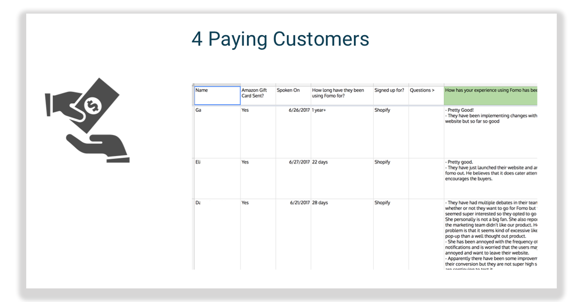
What I learned from paying customers:
- The very reason they are our customers is because they believe in the concept of fomo
- They have seen substantial improvements in their conversion rates using Fomo
- Upon further investigation, I also learned that all of them had Google Analytics connected with Fomo which gave them much better tracking data

What I learned from customers who cancelled:
- The main reason why they cancelled is because they didn’t see any value being generated by Fomo
- Upon further investigation, I learned that none of them had Google Analytics connected to their account
- When I asked why they didn’t connect it, they mentioned that they didn’t notice it and the importance of connecting it was not clearly communicated
I also learned the importance of connecting Google Analytics and I might include it as a part of the main flow in future iterations based on performance of the product.
Both user groups were hungry to learn more about Fomo and Conversion Rate Optimization in general. They were looking for tutorial videos not only on our website but also on YouTube to make better use of this product. I informed Ryan about this immediately and suggested he start working on them immediately.
07. Misc Research:
Along the way, I was reading various articles on how to effectively perform user onboarding without losing the user’s trust/interest, what the normal conventions are when it comes to using forms and sampling different credit card forms to see which one of the most effective.
I dug a bit more deeper into FullStory and noticed some bugs which Ryan and his team fixed immediately.
We were also receiving constant feedback via emails from our clients which Ryan was kind enough to forward me instantly. This informed my insights and recommendations I’d share at the end of the project.
08. User Tests:
I still wasn’t sure what the break in the whole chain is and was growing a bit frustrated for not having a strong hypothesis on why the current on boarding process was not working as effectively as it should and then I did the user tests which blew my mind away!
I tested Fomo’s staging website (which is exactly the same as the LIVE website) with 8 users and only 2 people were able to finish the simple task I gave them! Yes, 6 out of 8 users failed to finish the task, in fact, they were not even close to finishing the task.

Here’s some more explanation:
Task details (this is what the users were asked to read out loud to ensure they understood the basics):
Fomo is a service that, once installed on your website, shows notifications to the visitors on your website when someone buys something. You can later customize this code to trigger based on custom events. Pretend you have a website which sells products online. You heard about this new thing called Fomo which might help you improve your sales and you want to register and get the embed code to get it working for your website.
The task:
Use any random email to sign up for a free trial account with credit card 4242 4242 4242 4242 with cvc as 123 and expiry date as 10/22. You can enter any website in the Your Website URL field and finish the whole process. Please think out loud.

All of the user tests were video recorded and I reanalyzed them again to find out what users did and were saying at particular timestamps and areas of the user journey
The main criteria for success was them to get the embed code and successfully sign up using the given credit card #.
I went through the videos multiple times and took notes on what the users were feeling, what they were thinking and saying out loud and what they were expecting based on timestamps in a separate Google Sheet.
This data was great but not enough to show my research findings to the rest of the team at Fomo so I overlayed the steps these users took in Omnigraffle over the userflow I shared above to show you how and when things went wrong.
Here are the ones that did not make it.
These are the 2 users that were successful.
Here's all of them!
User Test Research Findings:
- Murphy’s Law was in full effect! People clicked the alternative options instead of following the simple flow laid out in front of them. My conclusion? Give them too many options and they will definitely confuse themselves. Netflix’s clean userflow made even more sense now!
- We gave them the fake credit card and they were more than willing to provide it to us and they still couldn’t do it!
- Imagine a skeptical user going through this and how soon we must be losing them?
- It is also important to notice that no one noticed the notification pop up in the lower left corner. They just wanted to “get it done” and in a hurry. Unless we have a bit of a pause and show them the notification as the only thing on the page, they are not going to notice it.
09. Deliverables:
Based on these findings I was able to build a new user flow for Fomo. Below are the changes i made:
- I got rid of the unnecessary repetitive steps
- The new flow now accepts user’s basic info along with the website up front and then directly jumps into grabbing the credit card details
- I made sure I suggested them to have some copy mentioning the number of trial days and when the trial will expire during these steps which was highly inspired from Netflix and NN Group’s recommendations
- I added an experimental feature of trying to find whether a web url is http or https. If that was not possible, we included a dropdown that was inspired from Google Analytics
- Since the new flow captured the user’s website up front, it gave the system some time to build the embed code in the time the user was entering the credit card details
- After the embed code was pasted, I included a step that verifies the embed code was successfully embedded on their website. If it wasn’t the system will prompt the user 2 more times before opening a chat / support ticket with the customer support team.
- The user also has the ability to override this step after the first time he/she has tried embedding it to keep them from losing interest in the signup process.
- I made the new notification creation process much more natural - as if you were talking to someone while making the first test notification and if they were looking for something complex, the flow will direct them to open a support ticket to resolve their query.
- I included a “Test” button to show the notification. Earlier, the notification showed automatically while a lot of other things happened on the screen all at once. None of the users noticed the notification from the user tests. This way, by pausing and having the users click the Test button, we create anticipation and a more likelihood that the users will see what they just created.
- Once at the final Dashboard, the user will be prompted to connect Google Analytics to Fomo.
Suggested User Flow
Based on this, I created new wireframes which closely resembled their current visual design theme.
I considered creating the final prototype in InVision but since most of these changes were based on changing the flow and majority of the elements were already in place, I just delivered the wireframes along with a walkthrough video explaining all of my research and walking them through the wireframes.
10. Next Steps:
Ryan and his team will be implementing these changes to their LIVE website very soon and based on the results, we will decide what changes are needed to be made.