

Problem Statement:
Disabled children in New York City are not receiving the therapeutic services they need because the process of finding a therapist is too cumbersome.
My Role:
I helped the team by helping them in all stages of our UX Process. We brainstormed and helped each other during each phase of the project. I helped the team design the prototype and interactions along with usability testing.
Platform:
Desktop Website.
Time:
Three weeks.
Tools:
Google, Google Forms, Google Sheets, Trello, Omnigraffle, Sketch, Invision.
Team:
Me, Atin Mitra and Allison Davies.
The Solution:
We used User Research and Usability Analysis to uncover User Behavior with EarlyHive’s existing prototype platform and redesigned it to improve user experience. We found two main interactions between the coordinators and the providers and we built our design solution catering to those needs.
The Process:
The above process was the main backbone of the whole project and since this early stage startup already had a working prototype, we had to improvise our research accordingly.
So our discovery phase started with learning what the company was all about, how therapists and the children currently coordinate, how they are solving their problems, what their workarounds are and what we can focus on during the 3 weeks of the project.
Then we narrowed down on the specific areas and interactions we can improve and shaped the flow of our project accordingly.
1. Usability Heuristics:
We started off by analyzing the existing prototype to determine the usability based on Nielson-Norman Group Usability Heuristics.
What we learned:
The platform is confusing to the average user and lacks helpful text.
If a user makes an error, there's poor error correction/handling
- Using Google Maps is great as it promotes user recognition over recall which improves user experience.
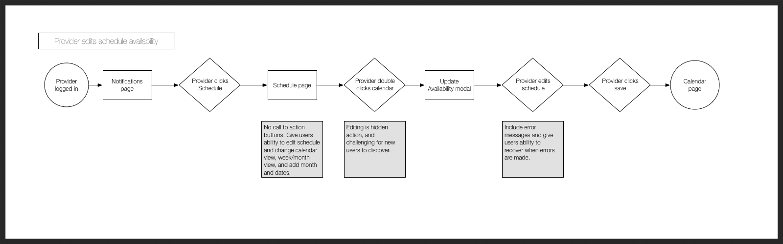
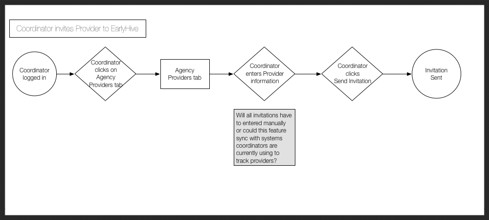
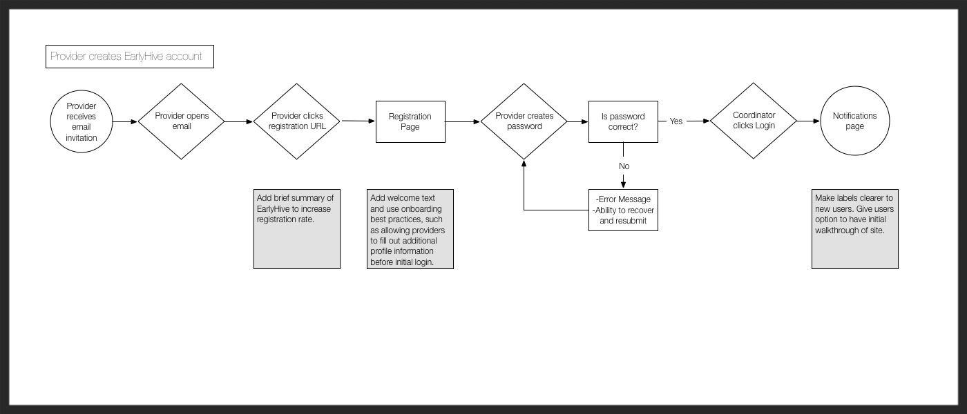
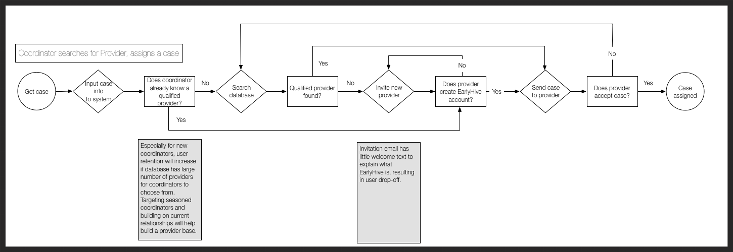
2. User Flows:
We used user flows to better understand what steps one needs to take to complete specific tasks like editing their schedule availability, creating/setting up a new account, etc.
What we learned:
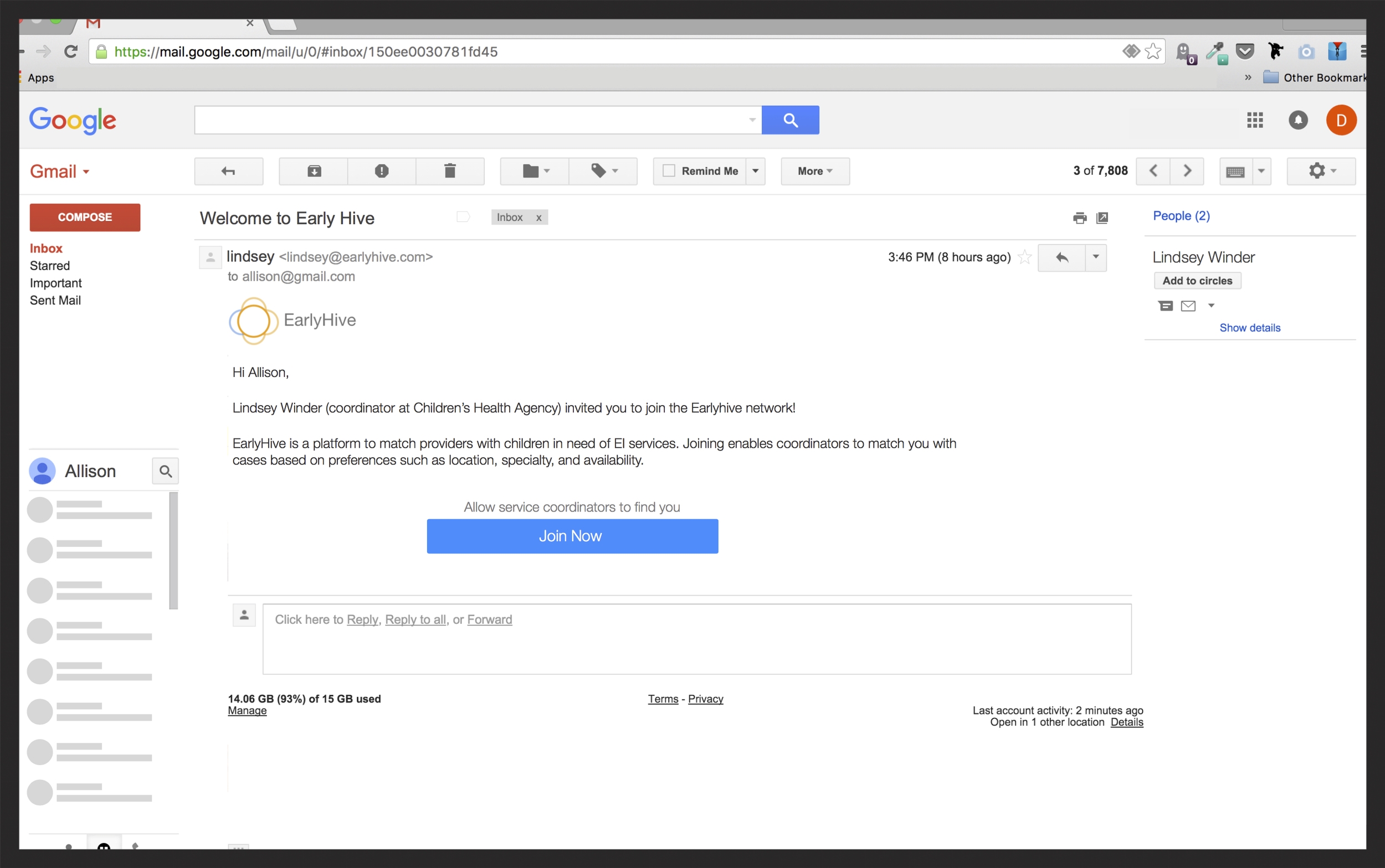
- Coordinators are responsible for entering most of the information for the providers, which makes their job tedious
- There are calls to action, but they are not prominent enough which may lead to more errors
3. User Interviews:
I was asking questions while Allison was taking interview notes. We also recorded the audio for this.
I was taking notes in this one. The phone you see was recording the audio for this interview.
To get a better understanding of what the user experience is like and what issues they are facing, we interviewed 3 providers and 3 coordinators.
4. Interview Analysis:
We discovered that there were two main tasks the users were trying to achieve.
- They were doing Case Search to find a suitable provider in the location they need
- There was a need to service the case using the platform
We divided our research in the form
We also made affinity maps to analyze the interview data based on how likely someone is to collaborate in real time vs. making decisions beforehand. We discovered that that most people’s decisions about what they were going to play was predetermined. They planned out what they were going to play ahead of time instead of randomly adding music tracks they like to a playlist.
5. User Testing
Since we already had specific tasks the users were trying to achieve, we got right into user testing. We also wanted to learn whether we did a good job of analyzing the usability heuristics and user flows.
Test with coordinators - Maggie and Justin
Tasks:
- Add a case
- Find a provider
What we learned:
- Users were looking for a search feature
- They were not sure whether the information was sent to the provider while asking them to join
Test with providers - Leanna and Leslie.
Tasks:
- Respond to case
- Enter availability
What we learned:
- Wants more case information before making decision
- Needs schedule to be more malleable for easier scheduling
Atin leading the user test while me and Allison took notes.
6. Personas
After performing user interviews and usability tests we learned that we would need to consider 4 types of personas based on their experience level.
7. Features & Prioritization
8. Design Studio
We performed a design studio with the client to learn more about their expectations.
9. Prototype & Test:
After communicating to our stakeholders, we found the most important user group to focus on was the Providers, so we built a prototype around the Provider platform and tested it with users.
Provider Platform Before
Provider Platform After

Provider Schedule Before

Provider Schedule After
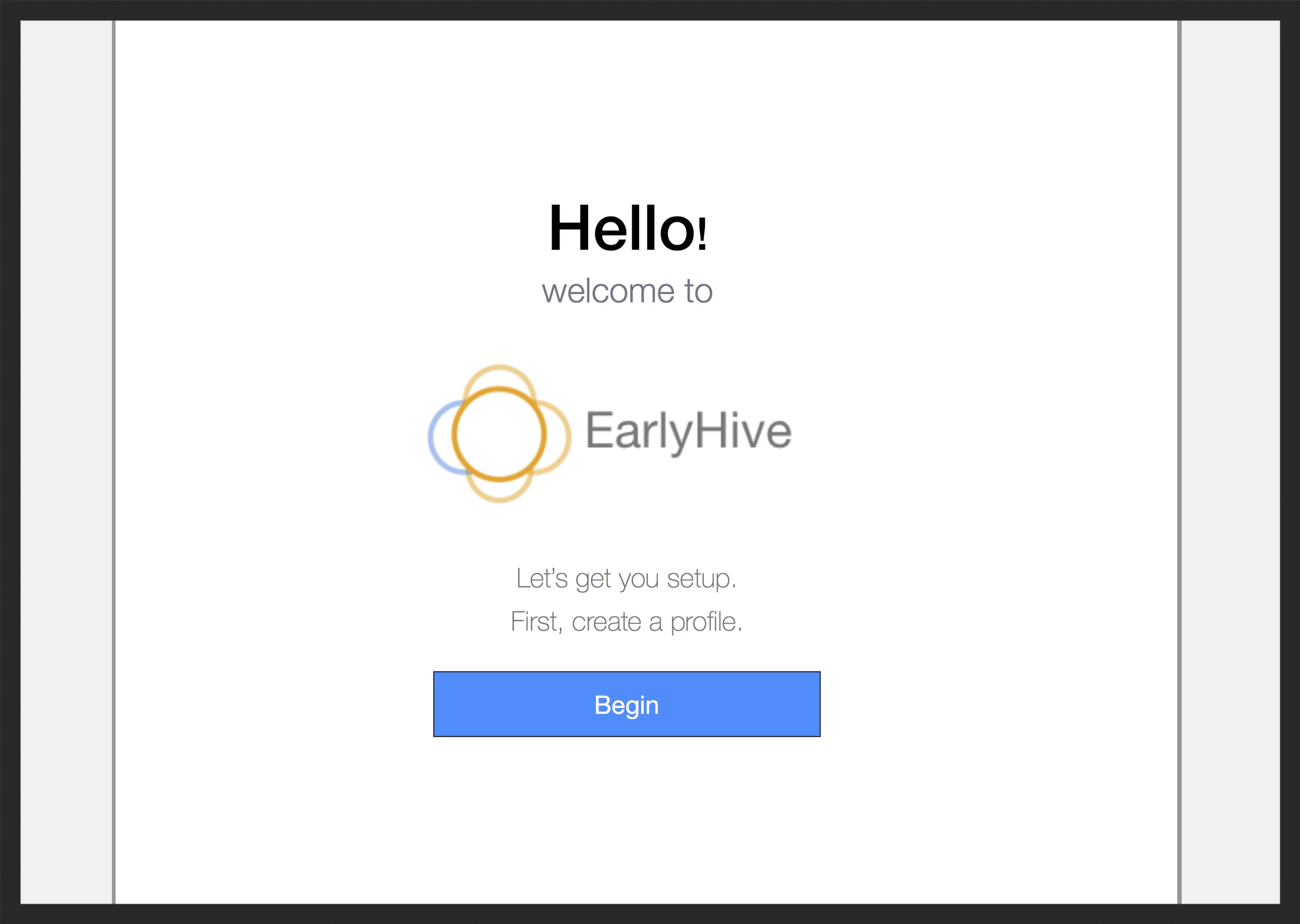
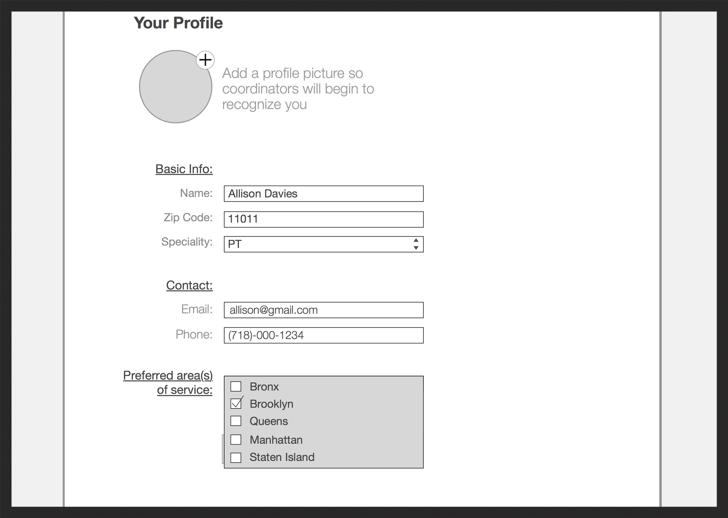
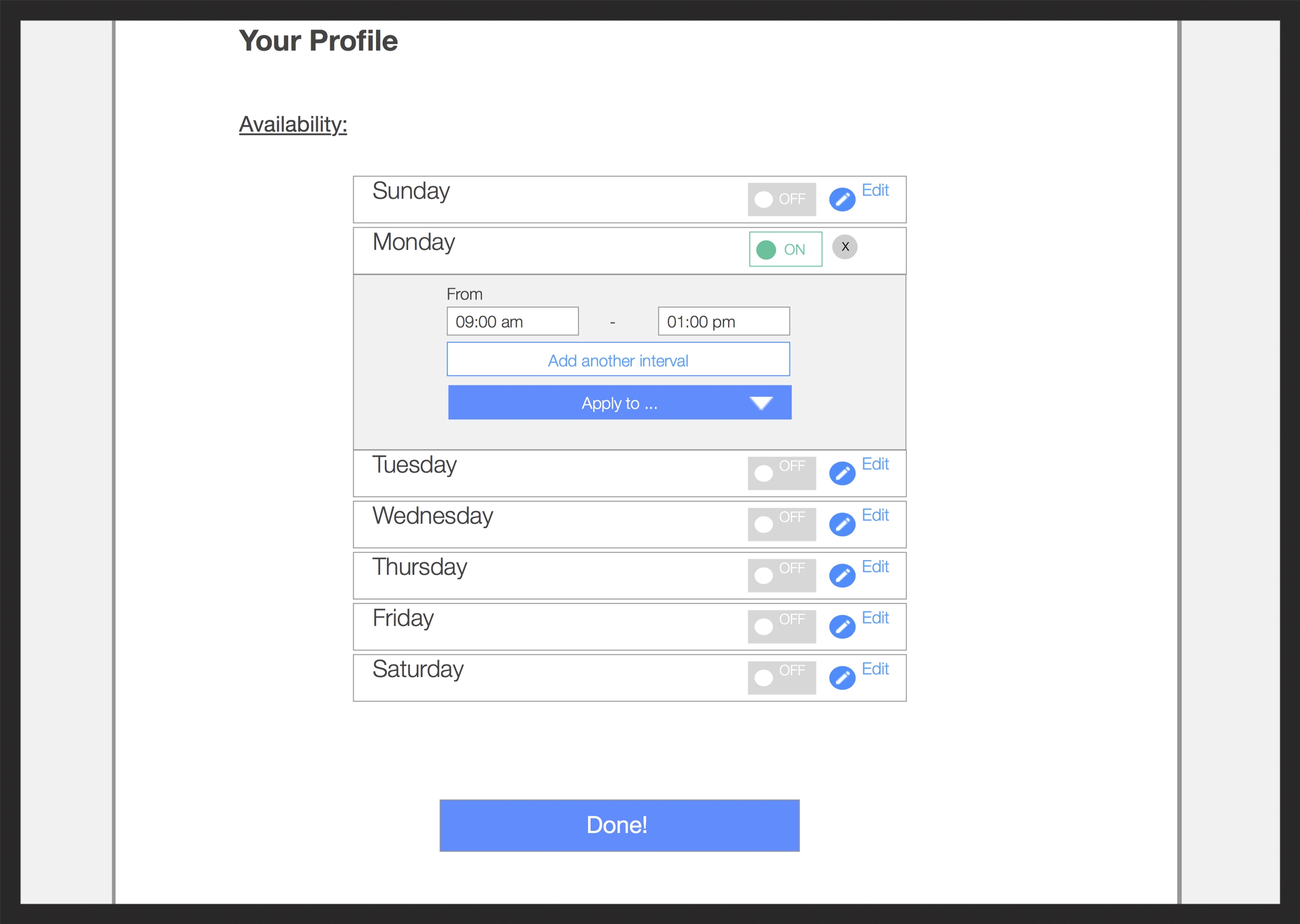
Provider Onboarding Screenflow
9. User Testing With 3 Providers:
Tasks:
- Create an account
- Enter Availability
Findings:
- Unclear about meaning of "Active cases"
- Unclear about who was doing case approval
- Desired more flexibility with schedule
10. Iterated Design
11. Next Steps:
- Launch MVP with redesign
- Track onboarding flow with Google Analytics
- Begin to integrate additional features in future iterations